
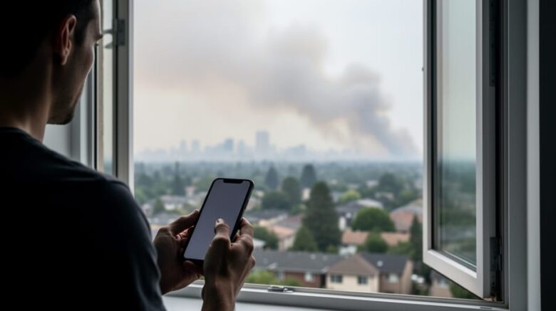
Air quality maps give you real-time data on pollutant levels in your neighborhood, tracking particulates like PM2.5 and ozone so you can make immediate decisions about outdoor activities, window ventilation, and whether vulnerable family members should stay inside. These digital tools translate complex atmospheric data into color-coded visualizations, turning “unhealthy” and “hazardous” from abstract terms into actionable warnings you can see at a glance.
When wildfire smoke blankets regions far from the flames themselves, or when industrial pollution spikes on stagnant summer days, checking an air quality map becomes as routine as glancing at weather forecasts. Recent smoke events affecting the northeastern United States from Canadian wildfires have pushed these tools into mainstream use. Platforms like IQAir provide live mapping with 48-hour forecasts, historical comparisons, and mobile apps that send alerts when conditions deteriorate.
Understanding how to read these maps matters because air quality directly impacts respiratory health, cardiovascular function, and long-term wellness. Children, elderly adults, and anyone with asthma or heart conditions face heightened risks during poor air quality episodes. What the map shows as a shift from green to orange or red represents measurable increases in microscopic particles that penetrate deep into lung tissue.
This guide walks you through finding reliable air quality maps, interpreting the color scales and pollution metrics, and translating that information into practical protective steps. You’ll learn which pollutants matter most, when to trust the data, and how these maps connect to broader climate patterns driving more frequent smoke and smog events across North America.
What Air Quality Maps Actually Show You
Air quality maps serve as your visual translator for invisible air pollution, converting complex atmospheric data into an immediately understandable picture of the air you’re breathing. These maps track specific pollutants, primarily PM2.5 (fine particulate matter smaller than 2.5 micrometers) and ground-level ozone, in real-time, gathering measurements from monitoring stations across regions and displaying them as a dynamic, constantly updating visualization.
The power of these maps lies in their color-coded system, which removes the guesswork from air quality assessment. Most maps use a spectrum from green (good air quality) through yellow and orange (moderate to unhealthy for sensitive groups) to red and purple (unhealthy to hazardous conditions). When wildfire smoke from Canada drifts into New York, New Jersey, or Connecticut, you’ll watch these colors shift across the map, showing exactly where smoke is driving air quality into unhealthy or hazardous territory.
- PM2.5
- Fine particulate matter measuring 2.5 micrometers or smaller that penetrates deep into lungs and bloodstream, primarily from wildfire smoke, vehicle emissions, and industrial sources. This pollutant poses the greatest health risk during smoke events.
- Ground-Level Ozone
- A harmful gas formed when sunlight reacts with pollutants, particularly problematic on hot, sunny days. Unlike the protective ozone layer above, ground-level ozone irritates airways and worsens respiratory conditions.
- Hazardous Air Quality
- The most severe pollution level, typically shown in purple or maroon on maps, indicating conditions that trigger health warnings for the entire population. Everyone should avoid outdoor activities when air quality reaches this threshold.
The real-time aspect matters tremendously during active smoke events. Modern platforms update their maps continuously, allowing you to watch pollution patterns shift with wind changes and track exactly when conditions improve or deteriorate in your specific area. This live tracking transforms air quality from an abstract concept into actionable information, similar to how the Air Quality Health Index provides health-focused guidance for Canadians navigating variable atmospheric conditions.
How Real-Time Maps Track Wildfire Smoke Across Regions
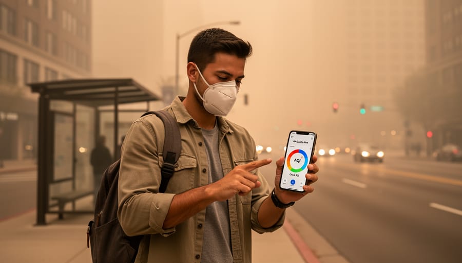
Real-time air quality maps operate through a network of ground-based monitoring stations that measure particulate matter concentrations every hour. These stations capture PM2.5 readings, the fine particles from wildfire smoke that penetrate deep into lungs, and transmit data to centralized systems that compile and visualize the information across geographic regions.
When Canadian wildfires send smoke southward into New York, New Jersey, and Connecticut, the monitoring network tracks this movement as it crosses borders. Satellites equipped with specialized sensors complement ground stations by detecting smoke plumes from above, providing coverage in areas without physical monitors. This dual approach creates a comprehensive picture of how smoke travels, accounting for wind patterns, atmospheric conditions, and topography that influence pollution dispersal.
The technology behind these maps processes incoming data streams continuously, updating displays as new measurements arrive. Most platforms refresh their maps every 60 minutes, though some high-traffic systems update more frequently during acute events. The color-coded overlays you see, ranging from green for good air quality to maroon for hazardous conditions, reflect the most recent pollutant concentrations recorded in each zone.
Data collection relies on optical sensors that count and size airborne particles, along with chemical analyzers that identify specific pollutants like ozone. These instruments feed measurements into algorithms that calculate the Air Quality Index for each location, then map services translate those numbers into the visual formats you access on your phone or computer.
The cross-border tracking capability proves essential during major wildfire events. When smoke from one region drifts into another, the interconnected monitoring systems document the pollution’s path in near-real-time, allowing affected communities hundreds of miles from the fire source to receive accurate warnings about deteriorating air quality headed their way.
Reading Your Local Air Quality Map: A Practical Guide
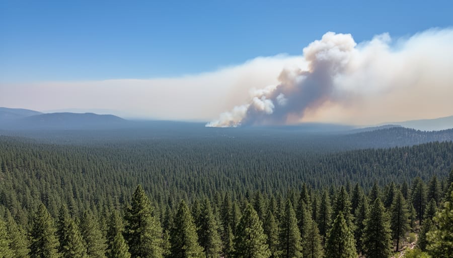
Open your chosen air quality map platform and look for your location using the search bar or by zooming into your region on the interactive display. Most platforms allow you to search by city name, ZIP code, or postal code, making it quick to find exactly where you live or plan to visit.
The color-coding system follows a universal pattern. Green zones indicate good air quality where outdoor activities are safe for everyone. Yellow suggests moderate conditions, generally fine, but sensitive individuals might notice minor effects. Orange signals unhealthy air for sensitive groups like children and people with respiratory conditions. Red means unhealthy for everyone, requiring you to limit prolonged outdoor exposure. Purple indicates very unhealthy conditions where everyone should move activities indoors. Maroon or dark purple represents hazardous levels demanding immediate protective action.
Pay attention to the specific pollutant readings displayed alongside the colors. During wildfire events affecting areas like New York, New Jersey, and Connecticut, PM2.5 readings spike dramatically. These fine particles pose the greatest immediate health risk because they penetrate deep into your lungs. When you see PM2.5 levels above 35.5 micrograms per cubic meter (the threshold for orange/unhealthy for sensitive groups), start adjusting your plans.
Use the forecast feature that many platforms now offer. Tools providing 48-hour forecasts show you when conditions will improve or worsen, letting you schedule outdoor exercise, children’s playtime, or outdoor work during cleaner air windows. Click through the hourly timeline to spot the safest periods.
Check the map multiple times throughout the day during wildfire season or pollution events. Real-time updates mean conditions can shift within hours as smoke plumes move or winds change direction. Morning readings might show safe conditions while afternoon smoke brings hazardous air, so verify before heading out rather than relying on yesterday’s check.
Major Air Quality Map Tools Available in 2026
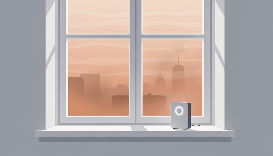
Several robust platforms now make it simple to check air quality anywhere, each offering distinct advantages for different monitoring needs. IQAir’s AirVisual stands out with comprehensive global coverage, providing real-time maps that track PM2.5 and ozone levels across continents. The platform offers 48-hour forecasts, helping you plan ahead rather than just reacting to current conditions. Its mobile app brings this monitoring capability wherever you go, essential when smoke from events like the Canada wildfires affects regions across New York, New Jersey, and Connecticut.
Beyond real-time data, many platforms now include historical tracking features that reveal pollution patterns over weeks or months. This context helps distinguish temporary smoke events from chronic air quality issues in your area. Developers can access APIs to integrate air quality data into custom applications, expanding the reach of this vital information.
| Platform | Coverage | Update Frequency | Key Features |
|---|---|---|---|
| IQAir AirVisual | Global | Real-time | 48-hour forecasts, mobile app, API access |
| AirNow | United States | Hourly | EPA-operated, fire and smoke maps |
| PurpleAir | Community-based global | Real-time | Hyperlocal sensors, free public data |
| BreezoMeter | Global | Real-time | Street-level resolution, pollen tracking |
When choosing a tool, consider your specific needs. If you travel internationally or want the most detailed forecasting, global platforms with mobile apps work best. For hyperlocal accuracy in your neighborhood, community sensor networks provide street-level precision. Most importantly, pick one or two reliable sources and check them regularly during wildfire season or when you notice hazy conditions outside your window.
When Air Quality Maps Matter Most for Your Health
Certain moments demand more vigilance than others when it comes to tracking air pollution levels. During wildfire season, smoke can travel hundreds of miles from its source, transforming a clear morning into hazardous conditions by afternoon. Recent events demonstrate this dramatically, with Canada wildfires pushing smoke across the border into New York, New Jersey, and Connecticut, turning skies orange and sending millions indoors. Real-time maps become your early warning system in these situations, showing exactly when smoke plumes approach your region.
If you have asthma, COPD, or other respiratory conditions, checking your local map before leaving home isn’t optional. Children and elderly family members face heightened risks from elevated PM2.5 levels because their lungs process air differently than healthy adults. What registers as “moderate” air quality for most people can trigger serious symptoms in vulnerable populations. An air quality alert means adjusting plans immediately, not waiting to see how you feel.
Athletes and outdoor enthusiasts should consult maps before morning runs or afternoon workouts. Exercise increases breathing rates significantly, meaning you inhale far more pollutants during a 30-minute jog on a smoky day than during hours of indoor activity. Communities like Canmore air quality watchers have learned to time outdoor activities around smoke patterns rather than simply canceling them entirely.
Planning outdoor events, from weddings to youth sports tournaments, requires checking forecast features that show predicted conditions 24 to 48 hours ahead. Rescheduling becomes easier when you spot deteriorating air quality trends early rather than making last-minute decisions as guests arrive.
The Connection Between Air Quality and Climate Change
Climate change acts as a force multiplier for wildfires, creating conditions that intensify both fire behavior and air quality threats. Rising global temperatures dry out vegetation faster, extending fire seasons by weeks or months compared to historical norms. Droughts become more severe and prolonged, leaving forests and grasslands primed to ignite. When these fires burn, they release massive volumes of particulate matter and carbon dioxide, degrading air quality across entire regions and sometimes continents.
The wildfire smoke impact stretches far beyond fire zones. Smoke from Canadian wildfires can blanket cities hundreds of miles away, as seen when northeastern U.S. regions experienced hazardous air quality levels in recent years. This cyclical relationship worsens over time: fires release stored carbon, warming accelerates, and conditions for future fires intensify.
Breaking this cycle requires cutting emissions at the source. Transitioning to renewable energy like wind and solar reduces the greenhouse gases driving temperature increases. Wind power generates electricity without combustion, eliminating both carbon emissions and the air pollutants that compound respiratory problems. Every megawatt of clean energy deployed helps stabilize the climate conditions that fuel extreme wildfire seasons.
Air quality maps reveal the immediate consequences of inaction, but they also highlight why renewable energy matters beyond abstract climate goals. Cleaner energy means fewer wildfires, less smoke, and healthier air for everyone. Monitoring air quality today is essential, but supporting emission reduction strategies protects the air quality of tomorrow.
Knowing how to read and use air quality maps puts the power of information in your hands. When wildfire smoke rolls into your region or pollution levels spike, you’re no longer guessing whether it’s safe to go outside or open your windows. You can check conditions in minutes, plan your day around the data, and protect yourself and the people you care about.
This isn’t just about reacting to poor air quality, it’s about building environmental awareness into your daily routine. Bookmark a reliable air quality map tool on your phone and computer so you can check conditions as easily as you check the weather. Share this resource with neighbors, especially those with young children, respiratory conditions, or elderly family members who face the greatest health risks when air quality deteriorates.
Beyond monitoring, consider supporting clean energy initiatives and policies that address the root causes of air pollution. The wildfires and emissions driving these hazardous conditions won’t disappear overnight, but every step toward renewable energy and emission reduction creates cleaner air for everyone. Your awareness today contributes to a healthier environment tomorrow.